When people buy food online, the photograph does the tasting for them. It has to show freshness, texture and trust in a single glance. For this project we handled food product photography for Hidden Health in our Dubai studio, creating a full library of e-commerce product photos and lifestyle assets across their range of jars, mixes and snacks. The goal was simple to say and exacting to deliver: clean, colour-accurate product images that lift appetite and stay consistent across every SKU and platform.
Below is a clear walk-through of the concept, lighting, styling and workflow we used. If you manage a growing FMCG brand, this case study will help you plan a repeatable system that scales.
Brand and brief: what Hidden Health needed
Hidden Health sits in the happy place between comfort and care. Bright, cheerful lids carry the brand palette. Ingredients are straightforward. The packaging is tidy and reusable. Our task was to translate that feeling into pictures that work everywhere.
Objectives
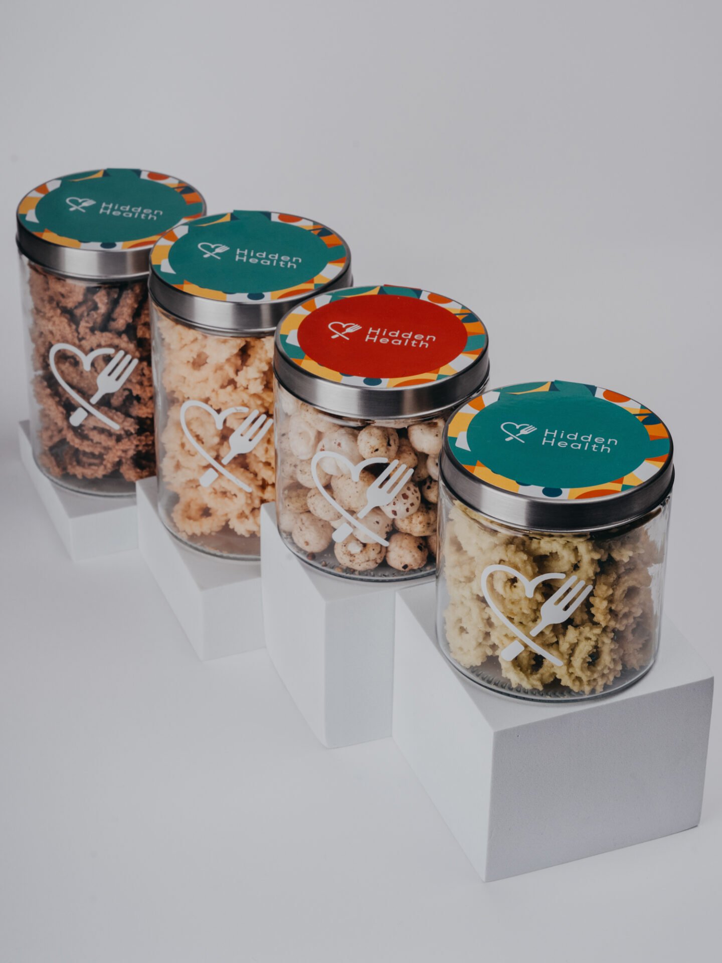
– Marketplace-ready packshots on white for each SKU
– A small lifestyle set per product to show appetite, texture and how the jars live at home
– A consistent lighting style and angle set so category pages feel steady on both mobile and desktop
– Precise colour handling so the lid artwork, labels and food tones match the real products
Where the images would live
– PDPs on the brand site
– Major marketplaces that require true white backgrounds and specific crops
– Organic social and paid placements (square and vertical)
– Simple press use for product round-ups
Success looks like tidy grids, higher click-through from thumbnails, fewer customer questions about colour or size, and faster upload cycles when new flavours arrive.
Creative direction: cheerful, honest, appetising
We designed a visual language with three rules.
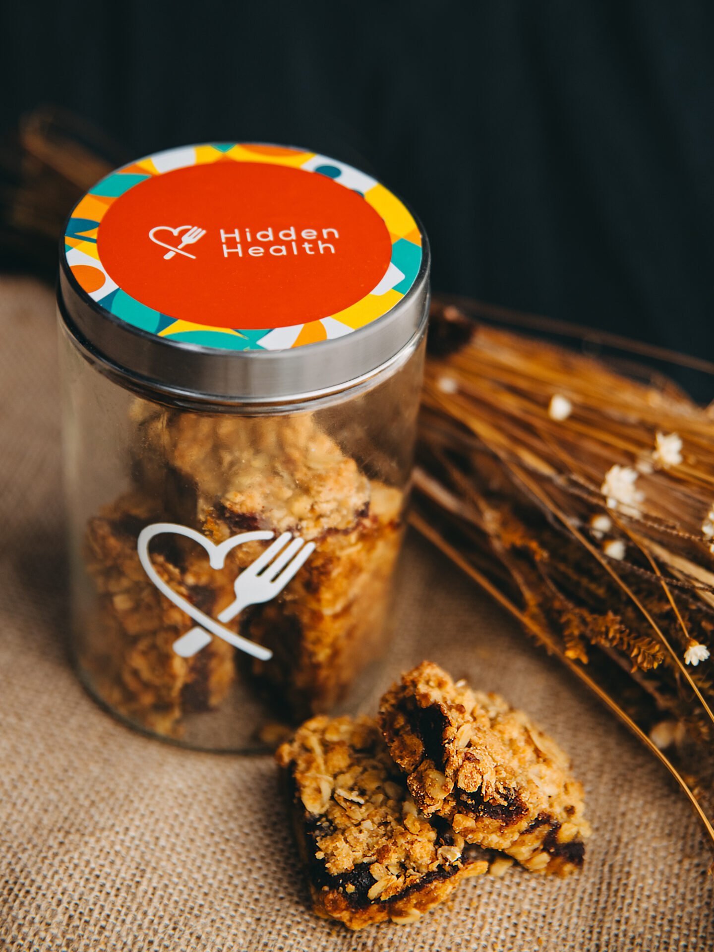
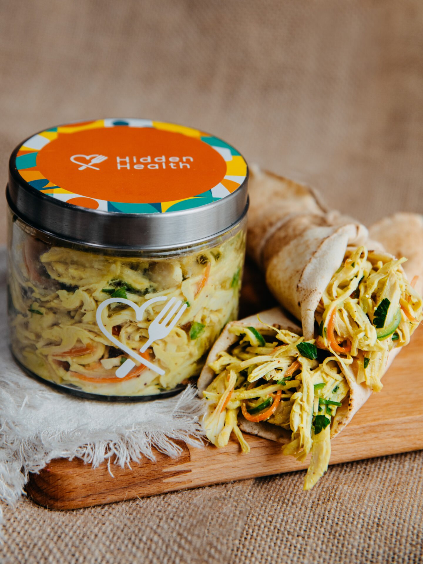
1. Let the brand colours lead. Lids do a lot of the talking, so the set around them stays quiet. Warm neutrals, light stone and soft wood keep attention on the product.
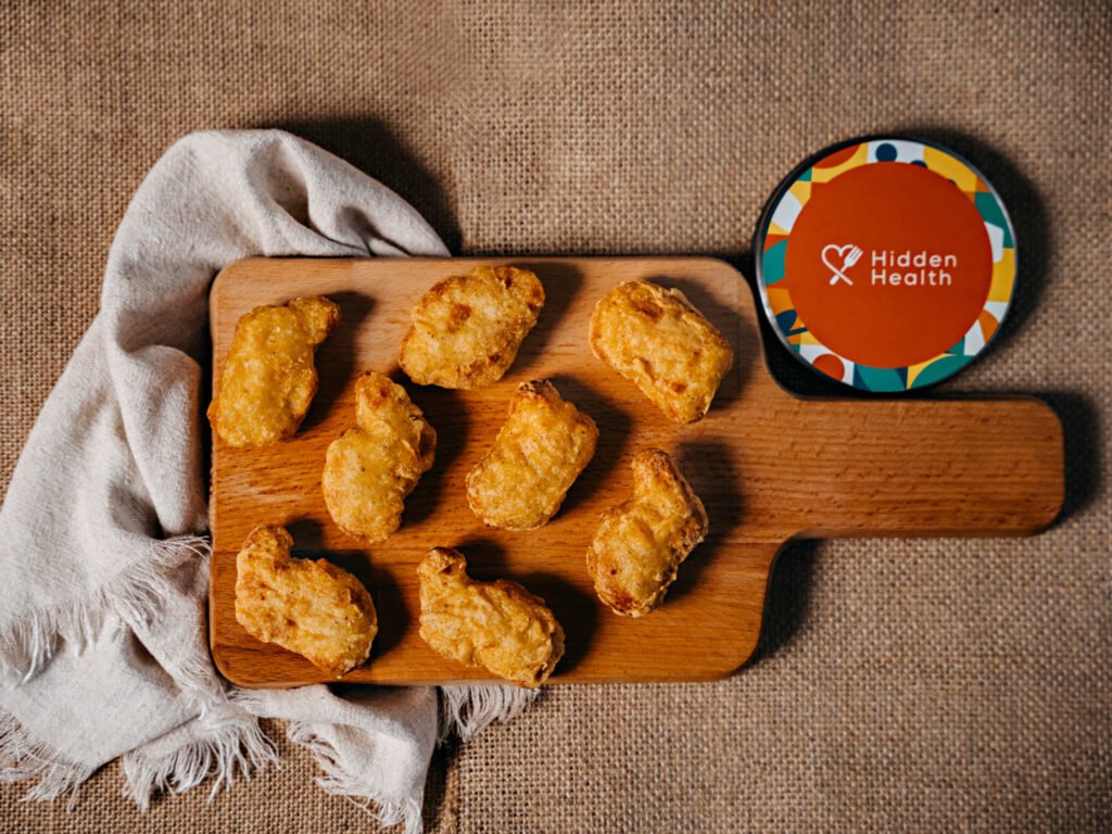
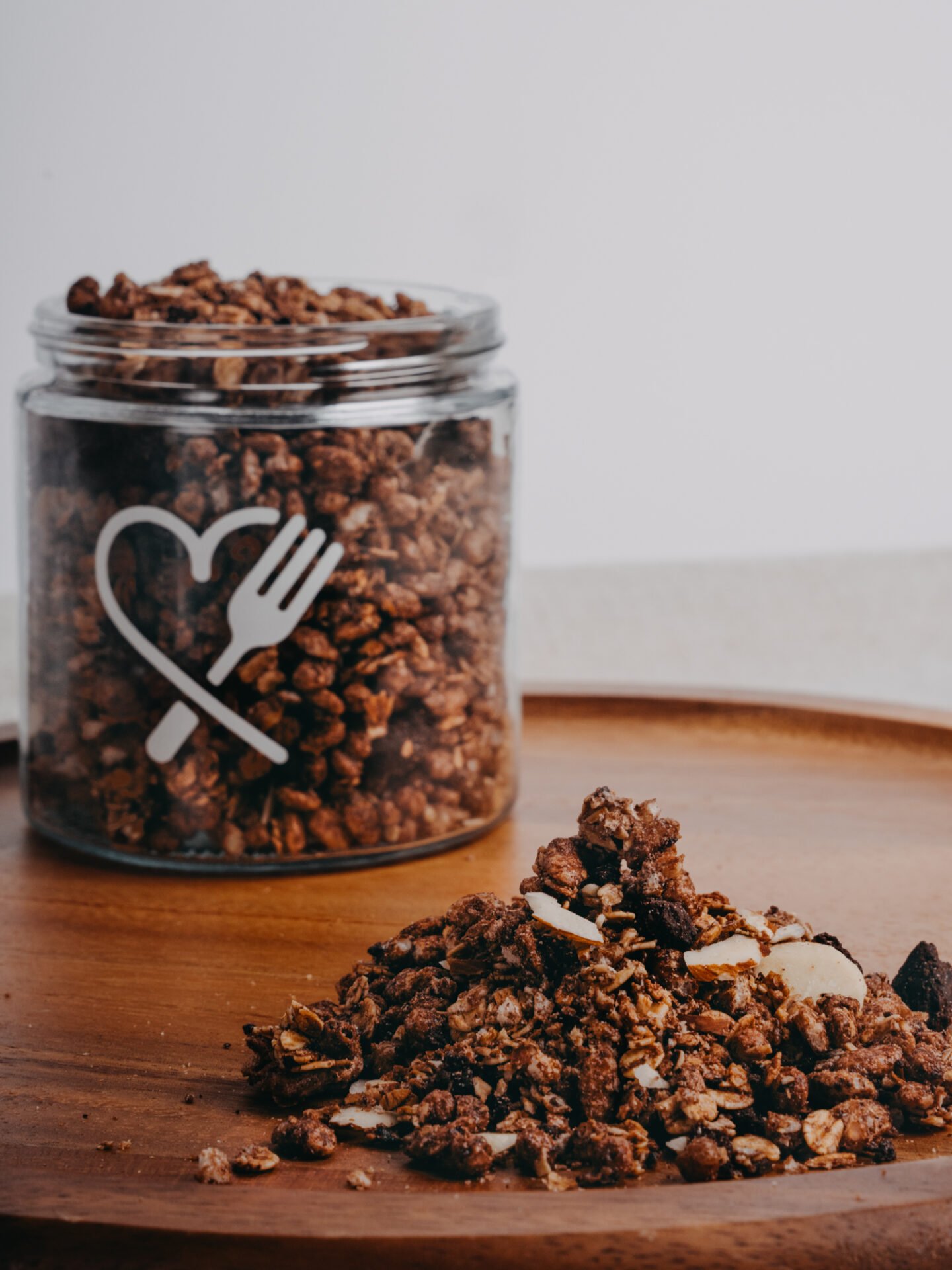
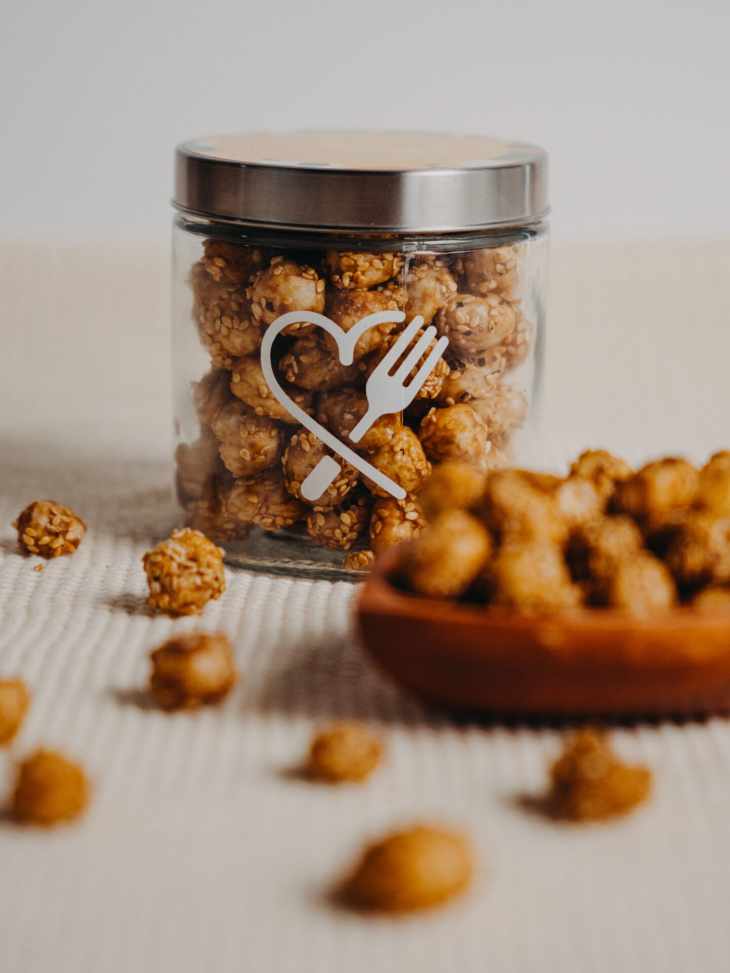
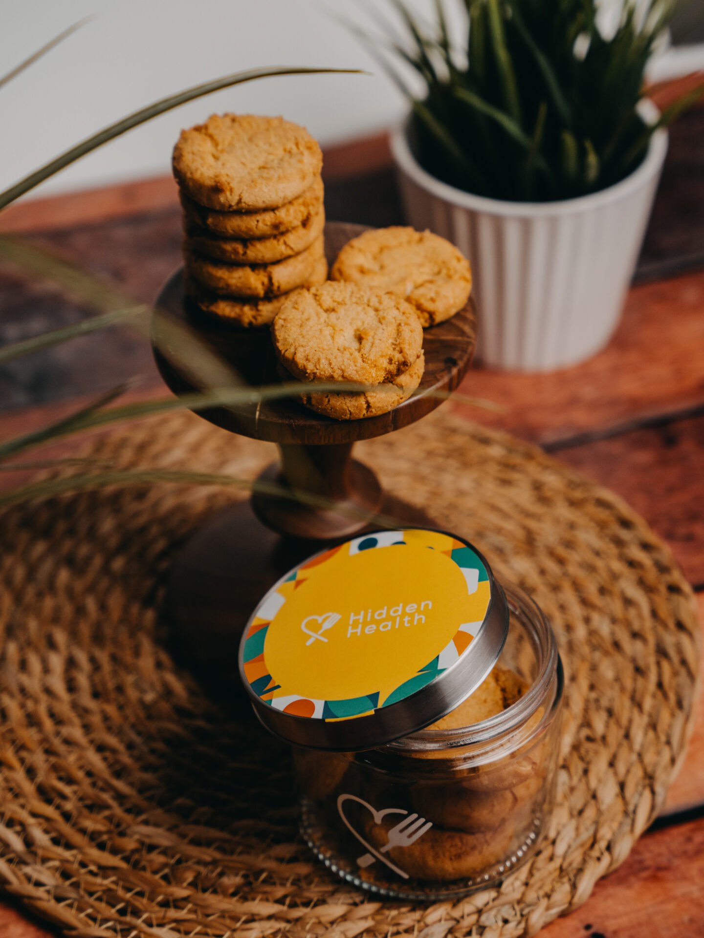
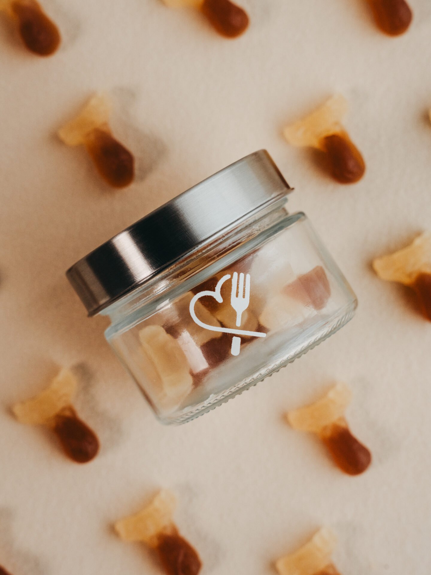
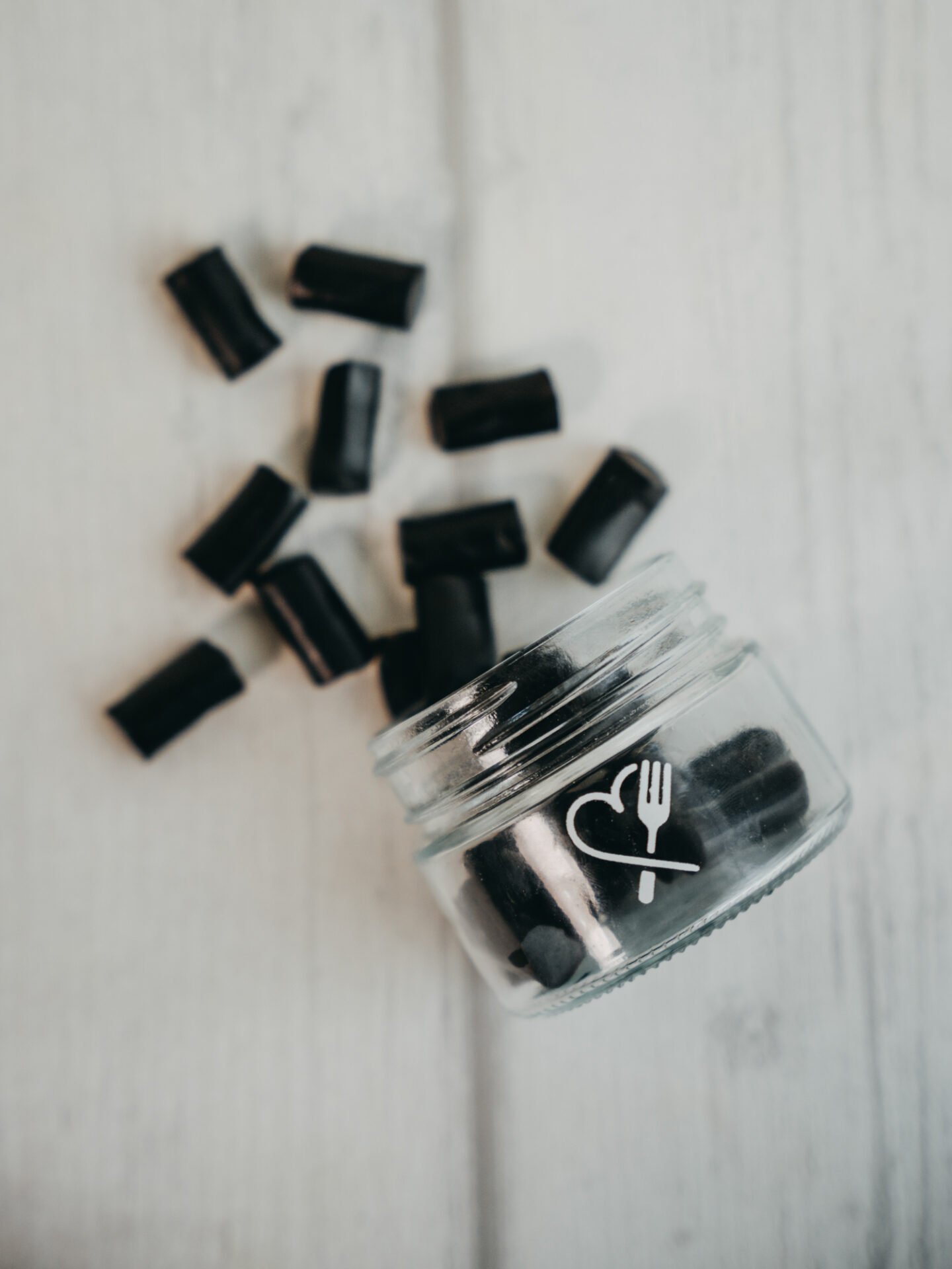
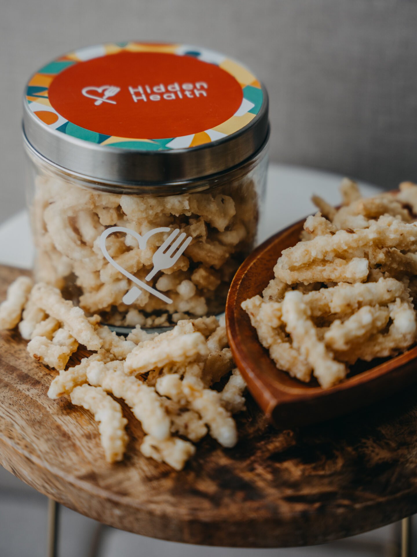
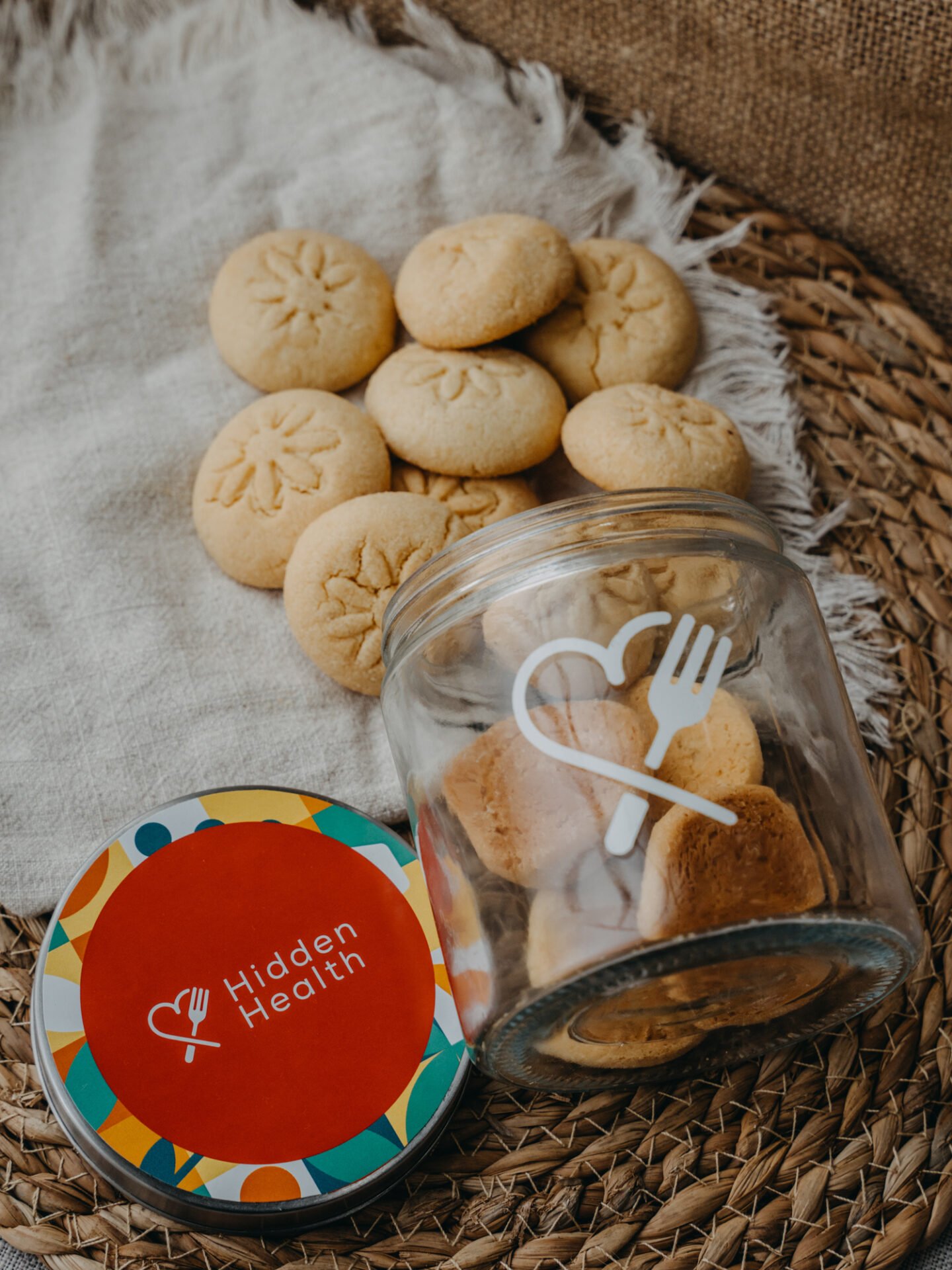
2. Show the food, not props. We used a small prop kit that supports the story without stealing the frame: linen cloths, clear glass, oats and grains, a wooden board, the occasional sprig. No busy crockery. No trend-heavy décor that will date the gallery in a season.
3. Compose for the small screen. Strong central heroes for fast scanning. Negative space for type when needed. Diagonals and gentle depth in lifestyle frames so the feed doesn’t feel flat.
This approach keeps appetite high and upload friction low. Designers can place type. Marketplaces can clip edges cleanly. Social crops still hold together.
Lighting strategy: glass jars, reflective lids, real food
Food and glass can be unforgiving. We built two dependable lighting looks and used them across the range.
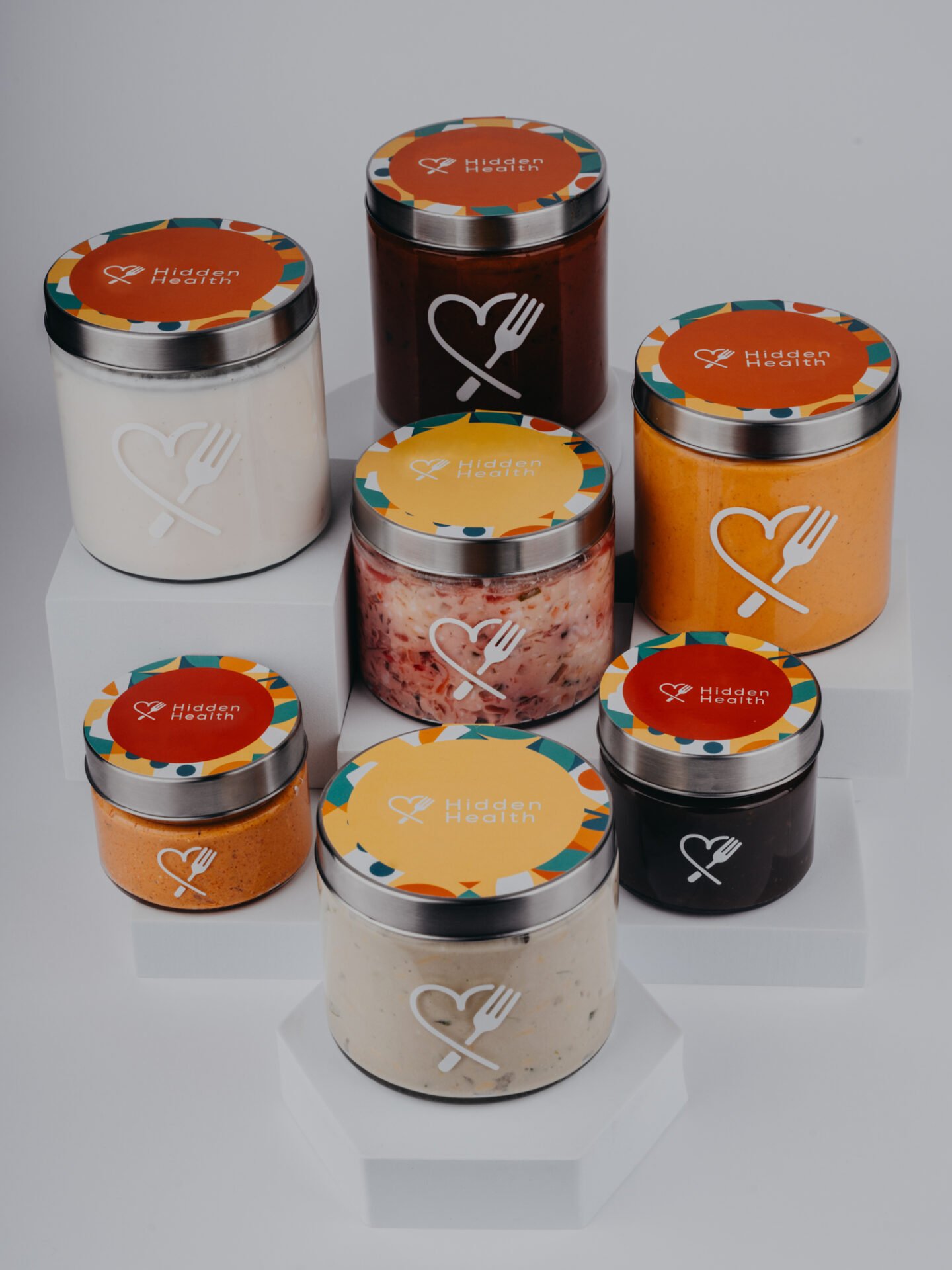
Packshots on white
Packshots need to be clinical without feeling cold.
– Key light – a large soft source at 45 degrees, slightly above the jar. We feathered the light past the subject so specular highlights stretch wide and soft rather than pin-point and harsh.
– Fill – a white V-flat at roughly 20–30% of the key to lift shadow on the label without flattening the shape.
– Background – a separate head aimed at the sweep, about one stop brighter than the subject, to achieve clean white that clips reliably on marketplaces.
– Flags – black cards to create slim dark edges on both sides of the jar and to stop reflections from the chrome lids washing the frame.
– Consistency – tape marks on the floor and tripod legs so height, distance and angle lock in from product to product.
This recipe gives even colour, clean edges and repeatable shadows. It also keeps the lid reflections tidy, which is crucial when your brand mark sits on metal.
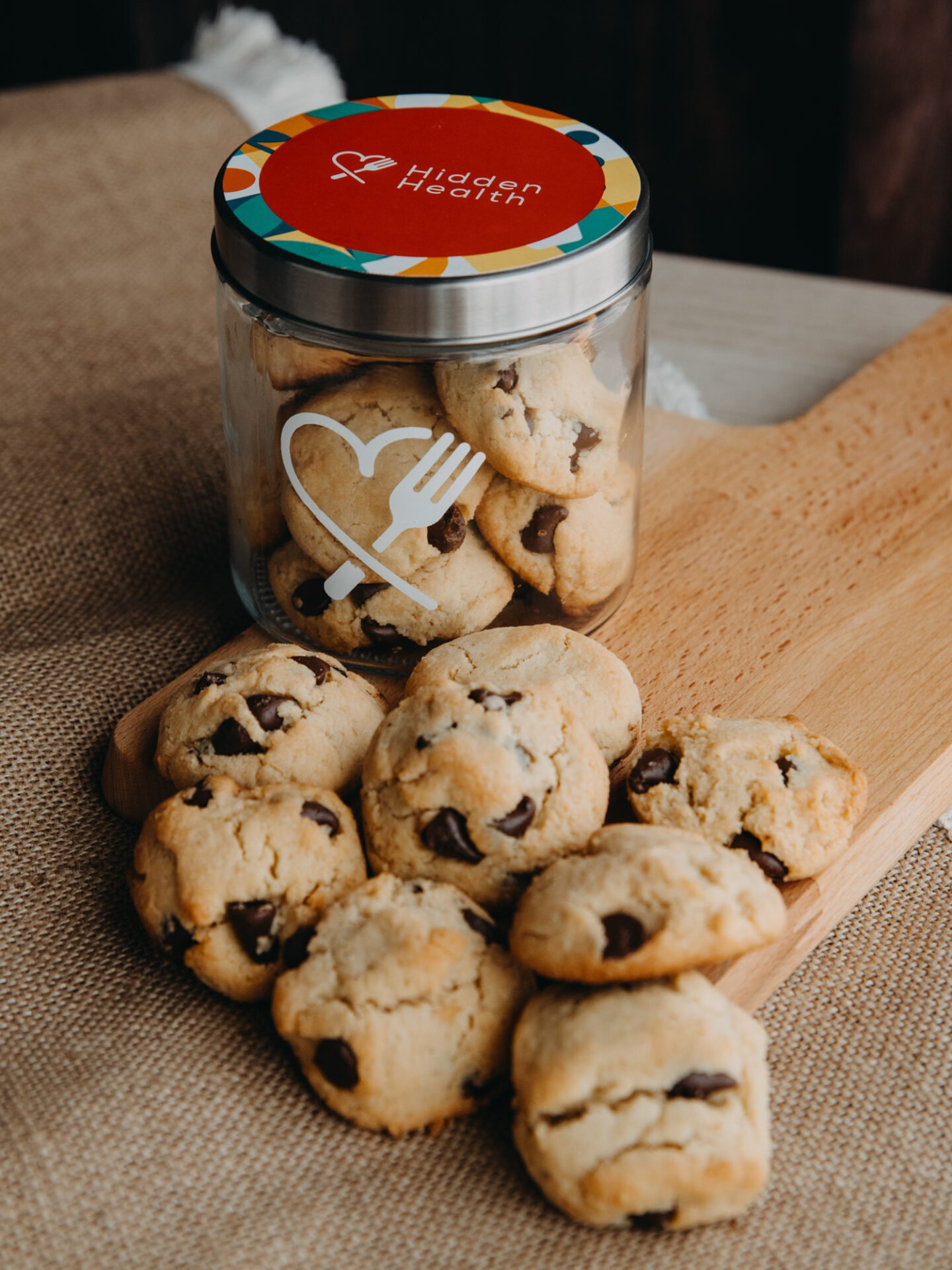
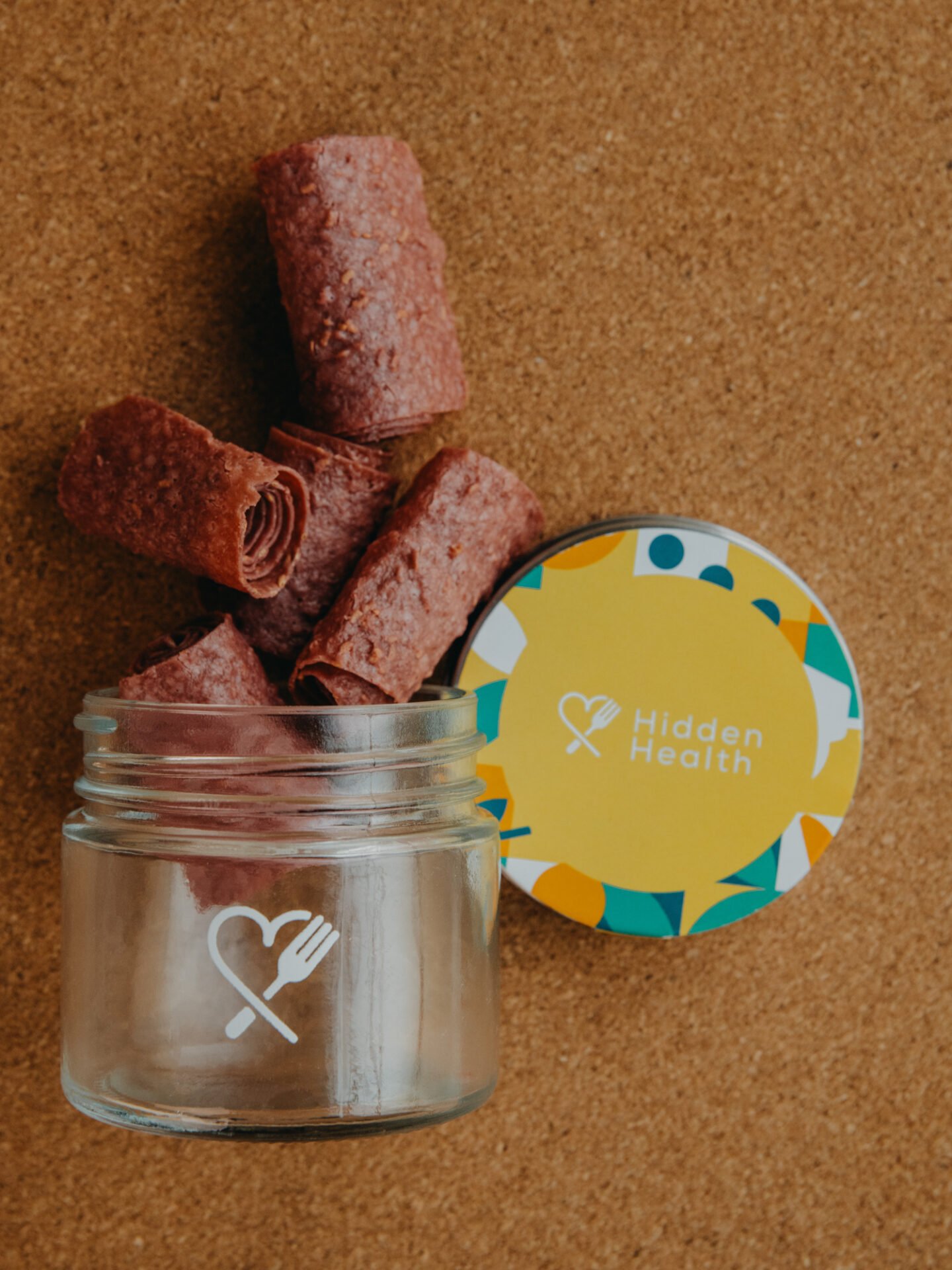
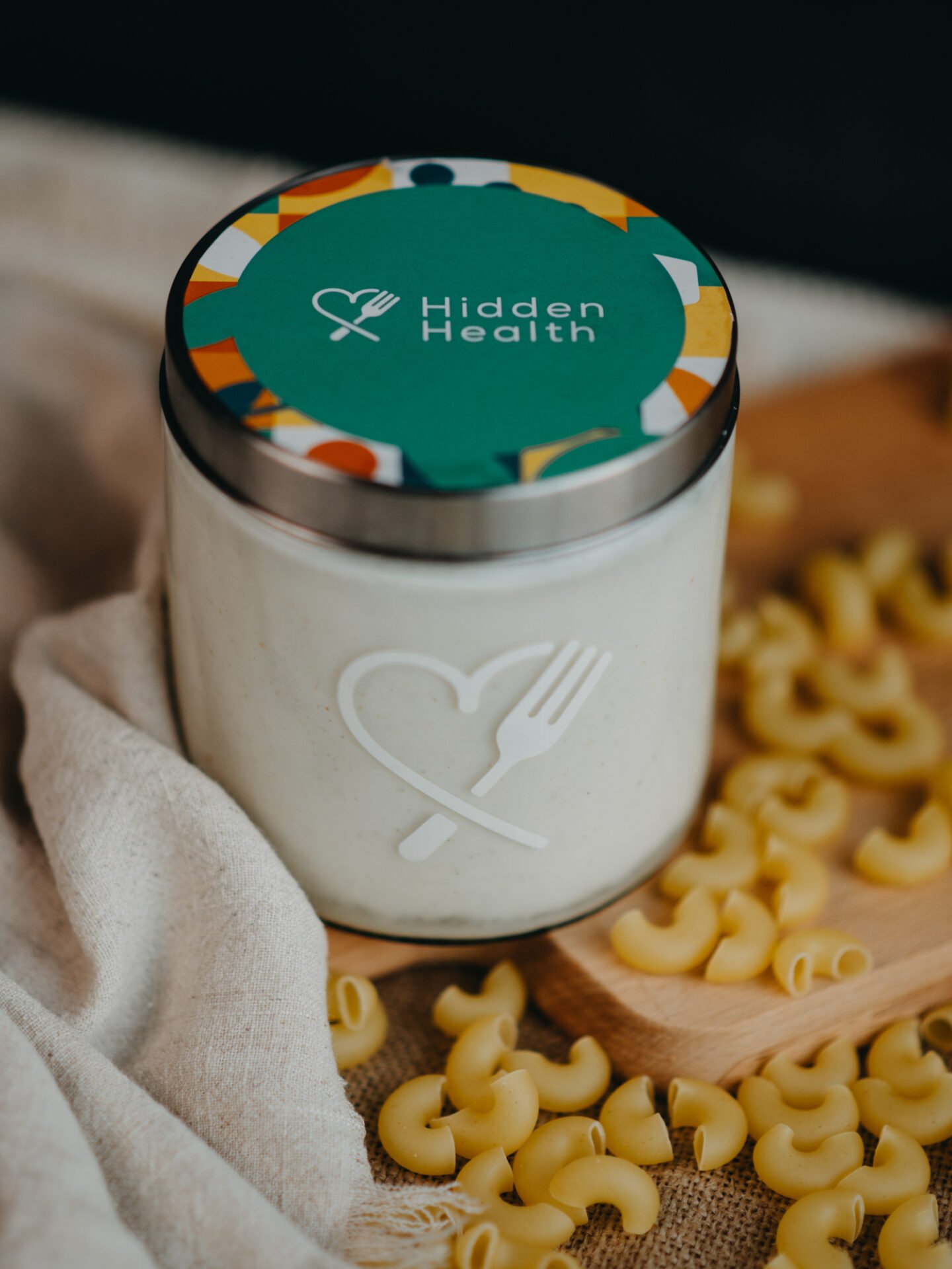
Lifestyle sets
Lifestyle frames do the appetite work and add context.
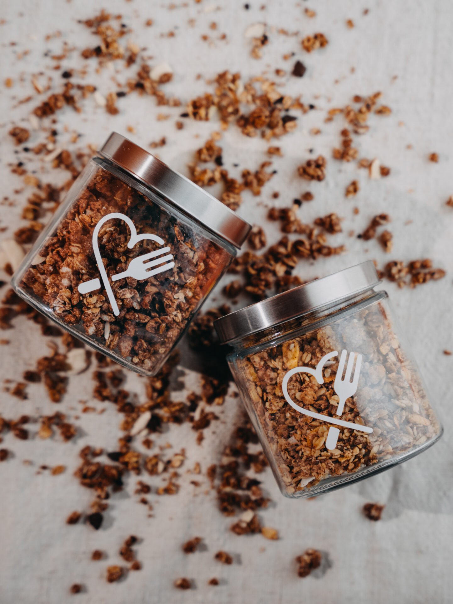
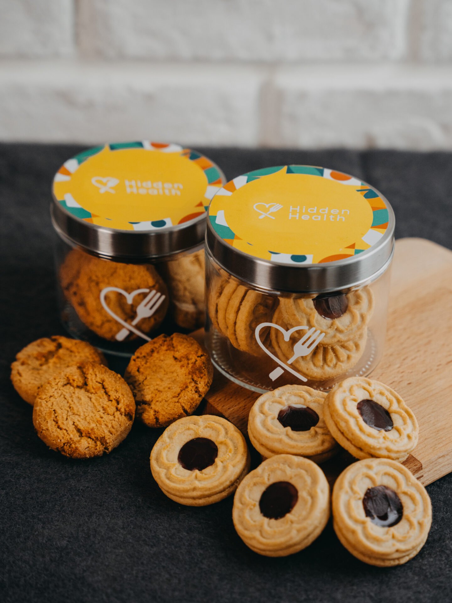
Variant A – window-light feel. We mimicked a soft window from camera left with a gentle kicker from behind to keep the label printable. This look suits cookies, granola and any product that benefits from a natural kitchen vibe.
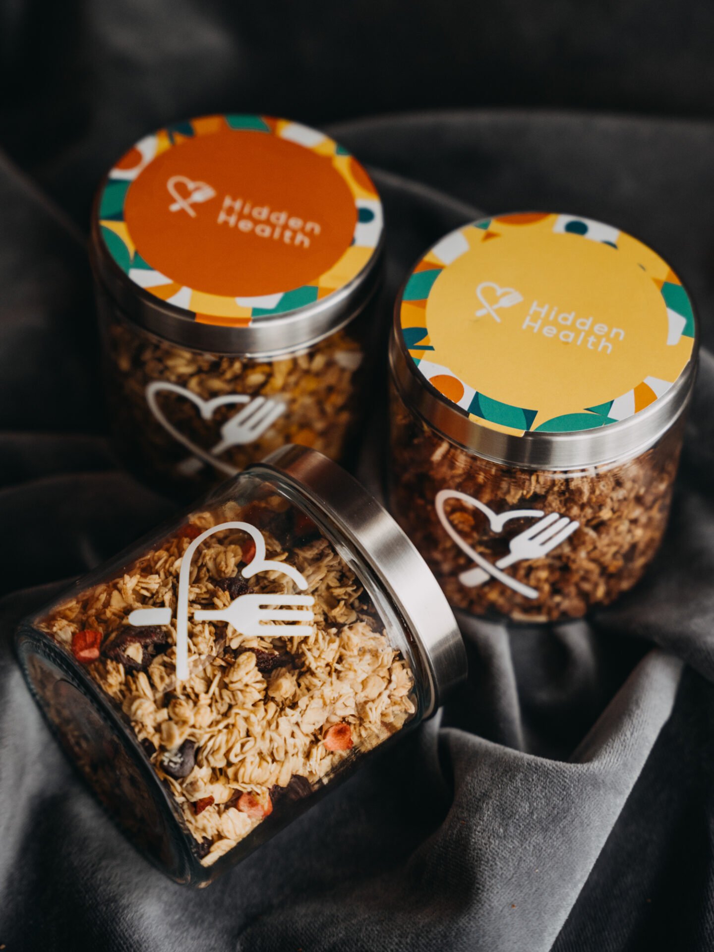
Variant B – warm editorial. A slightly deeper key with a subtle gradient on the background adds shape without drama. Perfect for darker mixes and chocolate tones.
Reflections under control. We adjusted the angle of the jar within the “family of angles” so the light sources reflect where we want them. A circular polariser came out only when a lid needed taming; we used it sparingly so we didn’t kill the honest sparkle.
Food styling. Stack heights, neat crumbs, a pour here and there. The aim is appetite with restraint.
Across both variants we shot a short burst of frames for each setup, then paused to zoom into labels and textures on the tethered screen. If something looked off, we fixed it in set, not later.
Colour management: why accuracy matters
Food buyers are sensitive to colour shifts, and rightly so. A turmeric-forward granola has to look warm, not orange. A cocoa mix needs depth, not mud. We kept colour honest with a simple discipline:
– Custom white balance at the start of every setup using a grey card
– A colour checker frame at the top of each SKU batch
– Locked Kelvin across heads so the environment doesn’t drift
– Tethered capture to a calibrated display for live checks
The brand palette on the lids includes strong oranges, teals and yellows. Holding those inside a tight tolerance avoids customer complaints and keeps grids looking sharp.


