Studio Lighting Looks for Editorial Portraits (Clean, Moody, Gel)
24 September, 2025
Share:
Light sets the tone before a single word is read. In editorial work, it frames character, signals intent and guides the reader’s eye to what matters. This guide presents Studio Lighting Looks for Editorial Portraits (Clean, Moody, Gel) with practical setups, reasons to choose each look, and fixes for common problems. It is written for teams that need dependable, repeatable results for web, print and press.
What makes an editorial portrait
Editorial imagery is message-led. Every choice supports a clear idea about the subject and their world. Define the purpose first – who will see the pictures, where they will appear, and what response you want. Keep the frame uncluttered, protect natural skin texture, and leave workable space for headlines or copy. Aim for a set that grades as one story and travels cleanly across platforms.
Core kit
– Key light with a second light or reflector for control
– Large modifier for soft spread, such as an octabox or diffused umbrella
– Gridded strip box or small reflector for shape
– Flags and negative fill to manage spill and deepen shadow
– Background light or practicals when required
– Colour gels and secure clips
– Meter or tethered histogram, grey card and colour checker
Look 1: Clean
Purpose: clarity, approachability and accurate colour. Ideal for leaders, personal branding pieces and magazine profiles that sit next to typography.
Setup A – one light clamshell with reflector Place a beauty dish or large octa slightly above and just forward of the subject, angled down. Add a white reflector beneath the chin to lift shadows. Use light grey or white paper. If a pure white background is required, light it separately one stop brighter than the key. Typical starting point: f/5.6 to f/8, ISO 100, shutter at sync speed, white balance at 5600 K or set with a grey card.
Setup B – two light high key Keep the key as above. Add a background head one to two stops above the key to clear the paper without flare. Flag the key and lens path to control spill.
Good practice
– Feather the key so the centre of the modifier is not aimed directly at the face, reducing hotspots
– Maintain tidy catchlights at roughly 10 and 2 for an alert expression
– Use a lint roller and tame flyaways; clean capture reduces retouch time
Where it excels Home pages, LinkedIn banners, investor decks, press kits. The look holds up under crop and heavy type.
Look 2: Moody
Purpose: depth, gravity and sculpted form. Suits long-form interviews, cultural features and founder stories.
Setup A – Rembrandt with negative fill Place a medium softbox 45 degrees to camera and slightly above eye level. Aim for a small triangle of light on the far cheek. On the shadow side, bring black foam board close to the face to increase contrast without noise. Keep the background one to two stops darker than the subject for separation.
Setup B – strip key with rim Use a gridded strip box as the key from the side to create narrow fall-off. Add a low rim on the opposite side to edge the jaw and shoulder. Flag both lights to prevent spill onto the backdrop. If practical lights exist in the scene, allow them to glow but keep them one to two stops below the face.
Good practice
– Turn the nose slightly towards the key and lower the far shoulder for a clean jaw line
– Avoid glossy fabrics that bloom under tight sources
– Protect shadow detail in camera so the grade remains flexible
Where it excels Thought pieces, campaign portraits with edge, album and book imagery.
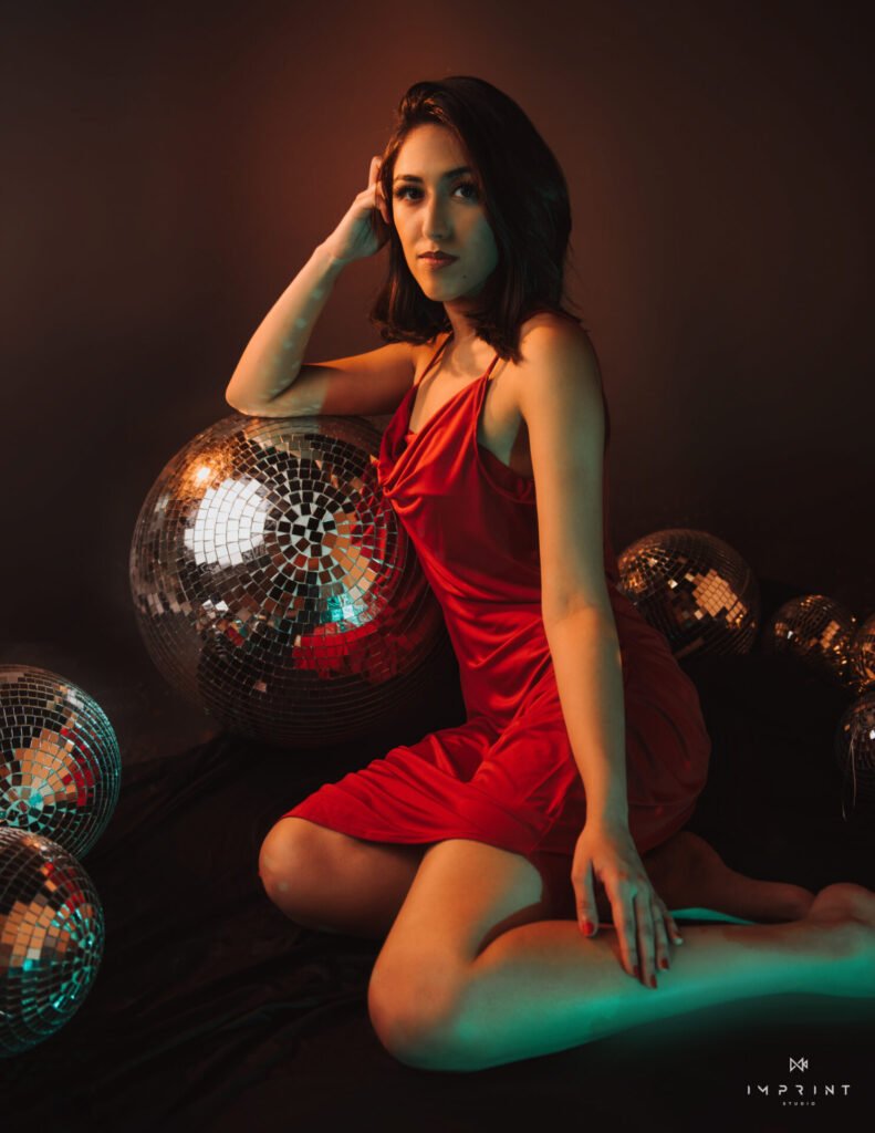
Look 3: Gel
Purpose: colour as character. Works for fashion, culture, music and brands with a strong palette.
Principle Keep one light responsible for clean skin, then let gels paint the background or act as rims. When everything is gelled, skin becomes muddy and difficult to grade.
Setup A – clean key, gelled background Light the face neutrally and wash the backdrop with a gel at one to two stops under the key so the colour reads rich rather than radioactive. Teal, magenta, deep blue and warm orange grade reliably.
Setup B – complementary split Maintain a neutral key. Add two rim lights behind with complementary gels such as cyan and orange or magenta and green. Keep the rims gentle so they kiss edges without invading cheeks or forehead.
Setup C – full gel with correction If a full cast is required, gel the key, then introduce a small ungelled kicker near camera to return life to eyes and lips. Anchor white balance with a grey reference so skin still reads human.
Good practice
– Meter each light; gels reduce effective output
– Balance to the neutral key and allow the coloured lights to sit where they land
– Watch reflections in glasses and adjust angles or add a small flag to kill ghosts
Where it excels Covers, feature openers, product or artist campaigns where colour carries the message.
Workflow for consistent sets
– Build background exposure first.
– Place the key and check skin tones on a calibrated display.
– Add fill or negative fill and review the jaw line.
– Introduce accents or gels and control spill with flags.
– Shoot a short test and zoom on eyes, hair and fabric for focus and artefacts.
– Lock the recipe and move through the shot list before exploring variations.
Problems and fixes
Flat, shiny skin: feather the key, reduce fill, add a small amount of powder and increase subject-to-light distance. Pull the reflector back to reduce under-chin bounce.
Raccoon eyes: raise the key or add a low bounce to lift sockets. A small white card on a stand often suffices.
Background banding: expose the background more cleanly by nudging ISO up and power down, or add a slight haze for smoother fall-off.
Muddy gels: lower gelled power, increase subject distance from the coloured light and lift the neutral key.
Glasses glare: raise and shift the key until the angle of incidence clears the lens; a small flag between light and spectacles can remove the hotspot.
Colour management and grading
Set white balance with a grey card at the start of each setup. When mixing gels or practicals, capture a colour checker for a trustworthy reference. Grade for one consistent look across the set. Keep skin believable even when the scene is stylised. Shape with selective dodge and burn rather than aggressive global clarity. Retouch lightly: remove the temporary, keep the character. Texture builds trust.
Editorial portraits are straightforward when decisions are made in the right order. Purpose first, then light, then pose and detail. Use Clean for clarity, Moody for shape, Gel for character. Keep the set tidy, protect real skin, and place the story at the centre of every frame. If you would like a team in Dubai that plans, lights and delivers files ready for web and print, book your session with Imprint, your trusted photography studio.